
Review: Quicken 2010 Deluxe for PC
| Creator/Producer: | Intuit | |
| Date Tested/Software Version: | October, 2010 (Release R10) | |
| Website: | Quicken.com | |
| Retail Price: | ~$40-$50 (Purchased New) |
It's that time again: Several years have passed since I last purchased Quicken, and it's time for me to give the next offering — Quicken 2010 Deluxe — a shot.
During these two years, I've come to the conclusion that Quicken 2008 Deluxe (review) was Intuit's best Quicken version to date. If I ran into any software glitches with 2008 Deluxe, I don't remember them. And the program did everything I ever needed it to do. (Except bake a good lasagna.)
(Note, though, that I tend to upgrade Quicken every two years, so I never so much as tried any of the Quicken 2009 versions.)

My History With Quicken
As best I can recall, I discovered the glory of Quicken sometime in the mid-1990s. As I mentioned above, ever since Quicken's 1998 release, I've upgraded every two years.
I'm well aware that lots of people hate Intuit's "ownership" of the personal-finance-software realm, and their all-but-built-in insistence on a four- or five-year upgrade cycle. However, I'm one of the few who doesn't hold it against them. Why?
Because the only software I use more often than Quicken is Microsoft Office. Rarely does a day go by that I don't fire up Quicken for some task or another. At a few pennies short of forty bucks (what I paid for Quicken 2010 Deluxe at Sam's Club), that's about as inexpensive-per-use as you're likely to find with professionally-built software.
So my point here, I guess, is that I use the heck out of Quicken. More than that, I depend on it.
Thus I am perfectly willing to pay for it every couple of years or so.
Is it outlandish to spend $40 or $50 every two years (though you could upgrade less often and still be okay) to keep up-to-speed with the best all-around personal-finance software out there?
I would suggest that it's not.
What Does Quicken Do?
With the recent demise of Microsoft Money, Intuit's Quicken is now the proverbial "last man standing" in big-name personal-finance software.
— Yardena Arar, PC World
There are alternatives to Quicken, certainly, ranging from simple Excel check-register spreadsheets to under-ten-bucks (and very dated) software like Simply Money, to open-source items like GnuCash. And YNAB 3 does budgeting in a way that makes Quicken hang its head in shame.
Despite all this, Quicken is the software everyone knows. It's been around (and upgraded annually) for 20+ years.
Among the things Quicken Deluxe can help you accomplish:
- Track all your bank, credit-card, and other financial accounts (transactions, balances, you name it)
- Attach and save documents (PDFs, etc.) related to your transactions
- Categorize your spending so you can see where your money is going
- Compare your monthly inflows and outflows on a real-time basis
- Track all your recurring bills, due dates, and payments and monitor their paid/unpaid status
- Track your investments and related accounts (401(k)s, IRAs, 529 plans, etc.)
- Track your assets (values) and liabilities (loan balances)
- Real-time monitoring of your net worth
- Extensive reporting and data-exporting (e.g., to Excel) capabilities
- View lots of pretty multi-colored charts and graphs of all the above!
Of course there's more to Quicken, but those are the biggies to little ol' me.
What's New in Quicken 2010?
Of course Intuit has "new features" for Quicken 2010. How else you gonna sell the same software title every four or five years?
Layout
Well, the desktop layout has changed again, for one thing. But this is no surprise. It's pretty much a "given" that when it comes to Quicken's annual releases, moving stuff around in the Quicken layout must be Requirement 1A for Intuit's programmers at their yearly "What are we gonna change this time?" meetings.
You'll find more navigation tabs now (see below), and those tabs have subsections. There also seem to be a few more customization options in this area than there were before.
Pop-Up Registers
Account registers can now be viewed in pop-up mode (a setting you change in PREFERENCES), which facilitates viewing more than one account's register at a time.
I consider this to be a valuable new feature. Could come in handy!
Improved Automatic Categorization
According to the guys at Intuit themselves:
"We've upgraded our categorization engine so Quicken does a better job of automatically assigning categories to the transactions you download, saving you time and making it easier for you to see where your money is going."
Okay. This one's useless to me, since I NEVER download transactions. But for the rest of you folks who like to roll the dice, perhaps this is a selling point. (I doubt it.)
And for anyone who's interested, here's a PDF listing the improvements made to Quicken over the years (copied from the HELP files of Quicken 2010 Deluxe):
Quicken Improvements Over The Years (185k)A "Getting Started" PDF From Intuit
Here's a PDF, straight from the folks at Intuit, detailing just how one would go about getting started with Quicken Deluxe 2010:
Getting Started: Quicken 2010 for Windows (360k)Lots of screenshots and such in there, if nothing else!
Surveying the Quicken 2010 Landscape
Navigational tabs are still where it's at, apparently. With Quicken 2010 Deluxe, though, there are more tabs, and those tabs now have subsections:

Shown above is the desktop you see by clicking the PLANNING tab, and then selecting sub-section CASH FLOW. (For me, this CASH FLOW section is easily the most useful feature of recent Quicken versions, in fact.)
Beneath that is an abbreviated window into your "Banking Reminders;" in other words, it shows your most recent and upcoming scheduled transactions ("bills," for the Quicken unitiated). The full list of your scheduled transactions (with their amounts, statuses, and so on) can be viewed from the BILLS tab, and selecting MONTHLY LIST:

Quicken's Foundation: Your Account List
The bread-and-butter of Quicken, of course, is its Account List. I keep mine docked on the left side of the desktop, but Quicken allows you can move it elsewhere via EDIT → PREFERENCES.

Accounts in the left sidebar are separated by type:
- Banking (Checking, savings, credit-card accounts, etc.)
- Investing (Brokerage accounts, 401(k)s, IRAs, etc.)
- Property & Debt (Mortgages, auto loans, and other assets and liabilites.)
Each "type" in the Account List can expand or collapse to manage space, showing or hiding the accounts it holds. When you want to view an account's register, you simply click its blue-hyperlinked name in the Account List, and its register appears on your desktop. (Or in a pop-up window, if you set the PREFERENCES to do so.)

Users of previous versions of Quicken (2008, for sure, had this glitch) had huge gripes concerning the Account List and its incessant "blinking" when one moused over its contents. That problem, as best I can tell, has been rectified in Quicken 2010. To accomplish this, it appears, Intuit programmers had to make only the account names clickable, rather than having an account's entire line (name and amount) hyperlink you to its register.
Categorizing and Tagging Transactions
Quicken has always allowed users to categorize their transactions for easy reporting and budgeting. And a few years back, Quicken added a feature called "tags" which gives users another way to classify transactions — and one that can span across categories. As the folks at Intuit describe it:
For example, you can use tags to group transactions for a specific event such as a vacation. Just create a tag called vacation, and tag all the applicable transactions accordingly. Later, to see the total cost of your vacation, you can customize a report such as the transaction report to include transactions with the vacation tag.
And this:
- Tags let you group transactions without categorizing them as income or expense.
- You can assign a transfer between accounts to a tag (for example, to show the purpose of the transfer).
- You can associate a tag with a specific copy of a tax form.
- Tags make it easy to track expenses in ways that would be very cumbersome with categories. If you used only categories to separate the expenses for two vacations, for example, you would need to create multiple versions of the same categories (Hotel Hawaii and Hotel Mexico, Airfare Hawaii and Airfare Mexico, and so on).
- Tags and categories used together provide more flexible reporting. In the vacation example above, tags provide the total vacation amount and categories can provide the detail (dining, lodging, airfare, and so on).
You categorize and tag (if desired) your transactions right in your accounts' registers, as you enter them:

In the Amazon transaction above, I used a category of "Loan to Others," which I use when I'm purchasing things on behalf of someone else. I also gave it a tag of "Use-tax Related." I enter this tag for all my use-taxable transactions in Quicken throughout the year.
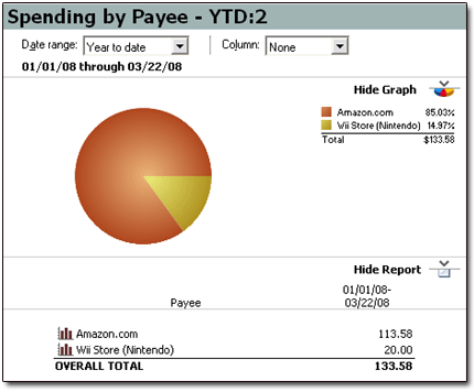
Next year, when it's tax-filing time, Quicken's reports make it a snap to tally up all my "Use-tax Related" entries:
Reconciling Accounts: Easy as Pie
Quicken's ability to help you reconcile accounts (i.e., verify that your transactions and balances in Quicken match up with those on your monthly bank or credit-card statements) is superb. Not much has changed here over the years, thankfully. It's an easy, three-step process for each account you wish to reconcile.
Once you have a bank or card statement in hand, select that same account in Quicken. Then click the ACCOUNT ACTIONS button, and select RECONCILE. A small window (called the "Statement Summary") pops up. It'll ask for beginning- and ending-balance info. You'll see something similar to this for checking accounts:
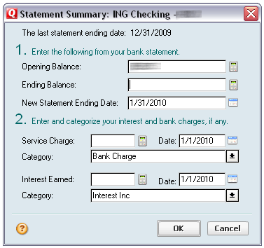
Plug in the required info, click OK, and the fun starts. Quicken lists all unreconciled transactions in your account. You simply match up the transactions in your statement with those in Quicken's window...
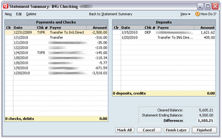
...and place checkmarks by the Quicken transactions which match those on your statement. If you have transactions that don't quite match, or if you have missing transactions ("Rut ro!"), it's easy to fix or add these from the Reconciliation window.
You'll know when you're done (fully reconciled!) because Quicken's lower-right report tells you so:

Even for folks who've never done it before, reconciling accounts in Quicken is about as easy as it gets. And it's vital, in my opinion, to do so.
I don't trust banks, credit-card companies, or other institutions to get things right any more than anyone else! (Not to mention anyone who takes my card and swipes it, out of sight, for payment . . ..)
By the Way: I NEVER Download Transactions!
That's right: I enter each and every Quicken transaction by hand.
Call me crazy, but I've heard far too many stories from readers who, after utilizing Quicken's ability to download transactions, found their data irrepairably trashed at some point.
So I'll just stick with typing my stuff in, thanks very much.
The "Home" Tab
There are a trio of new-to-me, always-current charts to be found in the HOME tab / MY MONEY section:
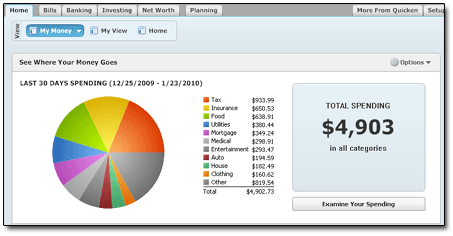
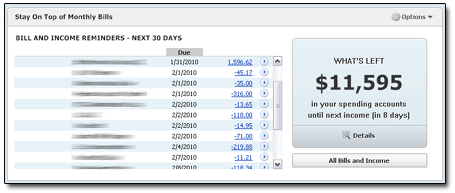
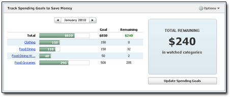
Of those, I'd surmise that the third one ("Track Spending Goals to Save Money") would be the most useful. Here you can choose certain categories to "watch." By clicking the UPDATE SPENDING GOALS button, you can set spending (okay, budgeting) goals for whatever categories you choose...
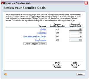
...and Quicken will then track your progress in those categories in the chart shown above.
Bills and Scheduled Transactions
Quicken 2010 Deluxe offers about 26 different ways to look at your bills (paid and unpaid; past and future) and other scheduled transactions.
Okay — the "26 different ways" is an exaggeration. But not by much. For instance, look again at the basic list of scheduled transactions. This version is found from the BILLS tab / MONTHLY LIST section:

Note that the tab for the BILLS section has several other viewing options, too:

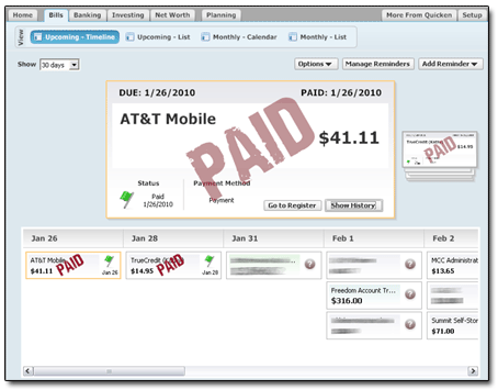
Here's the "UPCOMING - TIMELINE" view:
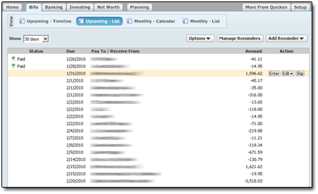
And the "UPCOMING - LIST" view (which actually is nice, as it spans across months, rather than just showing one month at a time):
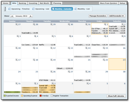
And the "MONTHLY CALENDAR" view, which is ... well, it's really just a mess:
I dunno. Are all these different ways of viewing bills necessary?
Cool, perhaps.
But really necessary?
Addressing Other Users' Concerns
The internet is crowded with comments from folks who, for whatever reason, have grown to despise Quicken. You'd think that after using Quicken for over 15 years now, I'd have found some reason to join them.
But ... no. I'm still a devoted Quicken fan.
And as such, I'd like to take this opportunity to address some of the user complaints I've seen lately:
Perhaps they do. However, the fact that Moneydance can't successfully convert your Quicken file isn't Quicken's problem; it's Moneydance's problem.
I've never had that issue with any Quicken release, 2010 included. Though it'd irk me, too.
I wholeheartedly agree. But as far as the desktop shortcuts go, well, I know how to use my DELETE key. And I can easily ignore the in-program stuff.
Here's a wager: Were that advertising to disappear, I betcha the price of Quicken would rise.
Never had that problem. Ever. Then again, I don't download transactions.
Seriously. When will you people learn? You're counting on two institutions — (1) your bank or brokerage, and (2) Intuit — to successfully "translate" your spending activity to each other. Given the huge number of financial institutions out there, and their now-oh-so-obvious incompetence at oh-so-many tasks, what are REALLY the odds that this can be pulled off without your data getting smoked?
Yes, with 2010, Quicken has changed their data format in order to suck more money from banks and other financial institutions. Welcome to capitalism.
Again, though: This is not a problem if you enter transactions manually.
Really, gang. It isn't that hard.
Summary
I don't know. As evidenced by my scouring of the web, a lot of people seem to hate Quicken 2010. But I'm not one of them.
As good as I thought Quicken 2008 was, I'm saying here that 2010 Deluxe is an improvement over it. Time will tell, though. If lots of glitches start showing up, then I'll report it here.
And all bets will be off.
Now ten months into my usage of Quicken 2010, I still don't have any problems to report. Through all my daily use, I've noticed no glitches or hangs of any kind.
| Ratings are on a scale of 1 to 5, with 5 being the top ranking. | |
|
value: Is it worth the money? |  |
|
adaptability: Could this work for me over time? | 
|
|
usage: Is its usage intuitive? Is it professional in appearance and function? | 
|


