 I find it pretty amusing that FMF, at Free Money Finance, penned an article yesterday entitled "Save Money by Going Back in Time."
Why amusing? Because it was such a coincidence. I was up late the night before, plowing through a 1973 issue of my hometown newspaper. I wasn't much interested in all the hubbub swirling around Richard Nixon's resignation (that's why someone in my family had saved the paper, I think). Rather, I was looking for prices.
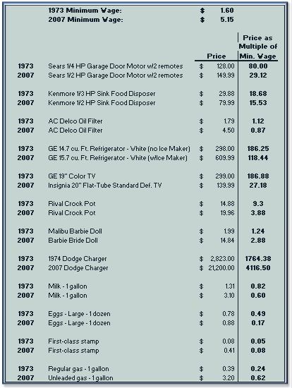
For whatever reason, I thought it might be interesting to look at prices of some common items back in 1973, and then compare those prices to similar items (well, as similar as one could get) in 2007. But I wanted to go one step further: I wanted to see how prices in both periods related to the minimum wage that prevailed at the time. How would prices in both periods look, say, when taken as multiples of their respective minimum wages?
Obviously, there are lots of factors that muddle a quick data-dig like this. The quality of similar goods isn't the same now, for one thing, especially when you have technology involved. (Think cars, TVs, computers, appliances, and so on.)
Here's what I came up with:

What to glean from this? Well, I had a hunch that most of the 2007 prices would show up as significantly "cheaper" than their 1973 counterparts. Cars, of course, are a big exception (but there are huge advances in performance and tech to consider again), as would be housing, higher-ed, and medical expenses (things I didn't have time to track down). At least, that's what I suspect I'd find. It's what Two-Income Trap told me, too.
The price of gas, as compared to an hour at minimum wage, did surprise me somewhat. For all the commotion we're seeing on this front right now, I still thought that the math would show prices to be about equal on the historical scale. I was wrong, obviously. Mileage is better now in most vehicles, so the price effect may be dampened somewhat.
In any case, I had fun looking through the old prices. I just hope my mom didn't dress 2-year-old me like the kids in all those ads.
Bleccchhh.
Labels: Automobiles, Odd 'n' Fun, Spending

